Website Redesign April 2024
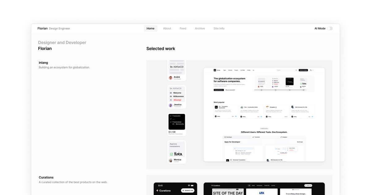
I did it again. I redesigned my website.
Why you may ask? Well, first of all, as a designer you are somehow addicted to change. You always want to try out new things, new styles, new layouts. And secondly, I wanted to make my website more personal, re-iterate on components and styles I've used in the past and make it more accessible and easier to navigate.
As you can see, the new layout uses much more space while setting the focus – again – on the content, first of all my work. I redesigned some of the components and worked on the typography to make everything more readable. The fonts used are now as well anti-aliased to make the text more readable on all devices.
As always, this is brand new and there might be some bugs or issues. If you find anything, please let me know. I'm always happy to get feedback: @flornkm
What's new?
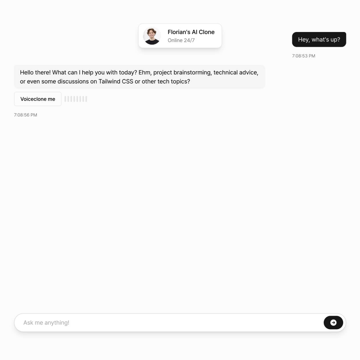
One of the biggest changes is the new AI mode. It's basically a clone of myself, which realistic voice expressions. It is currently accessible only via an access code.
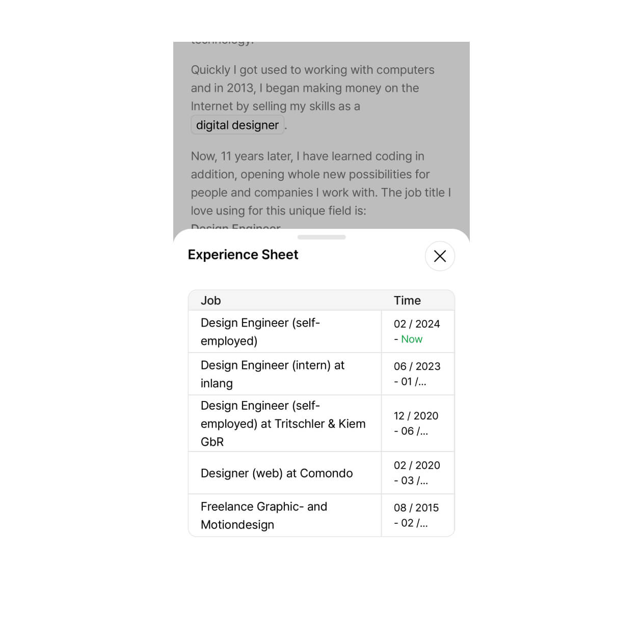
Drawer Component instead of default popup modals. This is, at least in my opinion, much more easy to use and looks better on mobile devices.
What's next?
Finetuning, working, and building. So I guess, see you in a bit!
